vrOS
Looking for the future of human-computer interfaces
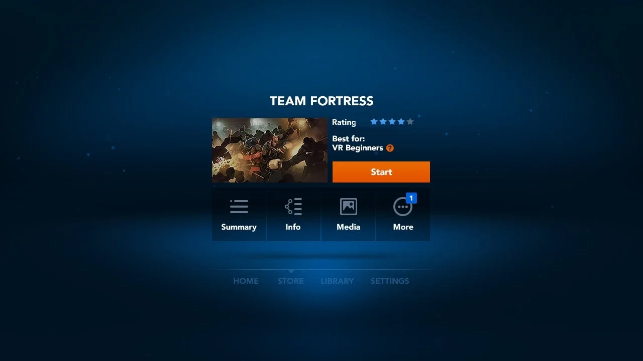
The original design for the operating system was largely influenced by common web and mobile user interface patterns. Most of this was the result of needing to ship something rapidly to meet the launch milestone for Oculus Rift.
As our design team freed up, I took this opportunity to help the team revisit the design of the HCI experience at a high level. The goals: uncover potential improvements in UI efficiency—particularly, but not exclusively, for the head-gesture based input model used on the Samsung Gear VR—and to unlock the potential for awe-inspiring product experiences.
Making the VR experience easier to use
Samsung Gear VR brought the technology to a broader audience, but not without its shortcomings. It required users to gaze with their neck to highlight UI elements and invoke action using a touch pad on the headgear located near the user’s temple—both with high potential for fatigue.
Hardware controllers alleviated the user from cumbersome touchpads or head-gazing, offering an improvement in user experience over previous options. Attempts at simplified controllers may have served sufficiently for navigating UI grids, but they severely hampered gameplay. The controllers eventually took on a familiar form for gamers. Not only is the modern video game controller a form of input gamers already understand, it significantly reduces fatigue, relative to the alternatives, and increases expediency. The UI models for the OS platform can leverage this, allowing for more robust and intuitive control. And when paired with an immersive visually-rich environment, it can make for a uniquely satisfying experience.
In-game interactions and inputs
Everything was on the table. I wanted us to find new easy, intuitive and effortless forms of input. But more importantly, whatever we designed at the system level had to ensure it couldn’t interfere with the existing game’s controls. The example below didn’t end up passing the test, but had a lot of promise.
Taking inspiration from art
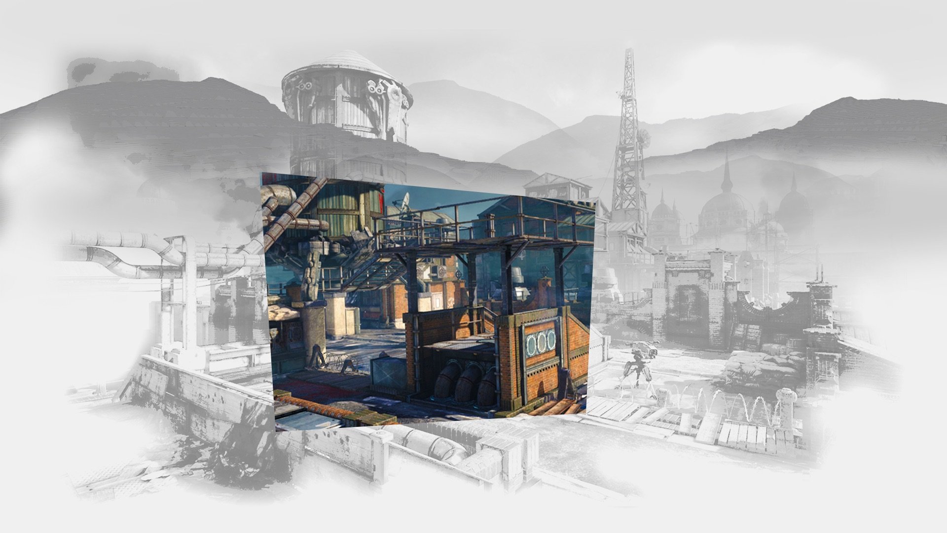
Anamorphic illusions and artistic retail sculptures served as inspiration, with depth, light, and dimension forming the primary characteristics of the early sketch phase. I sought to help elevate the product experience beyond flat 2-dimensional planes, instead leveraging the aforementioned characteristics to display information diegetically.


