Delivering jumbo-sized delight.
Building Apple’s first small multi-touch device.

iPod goes square.
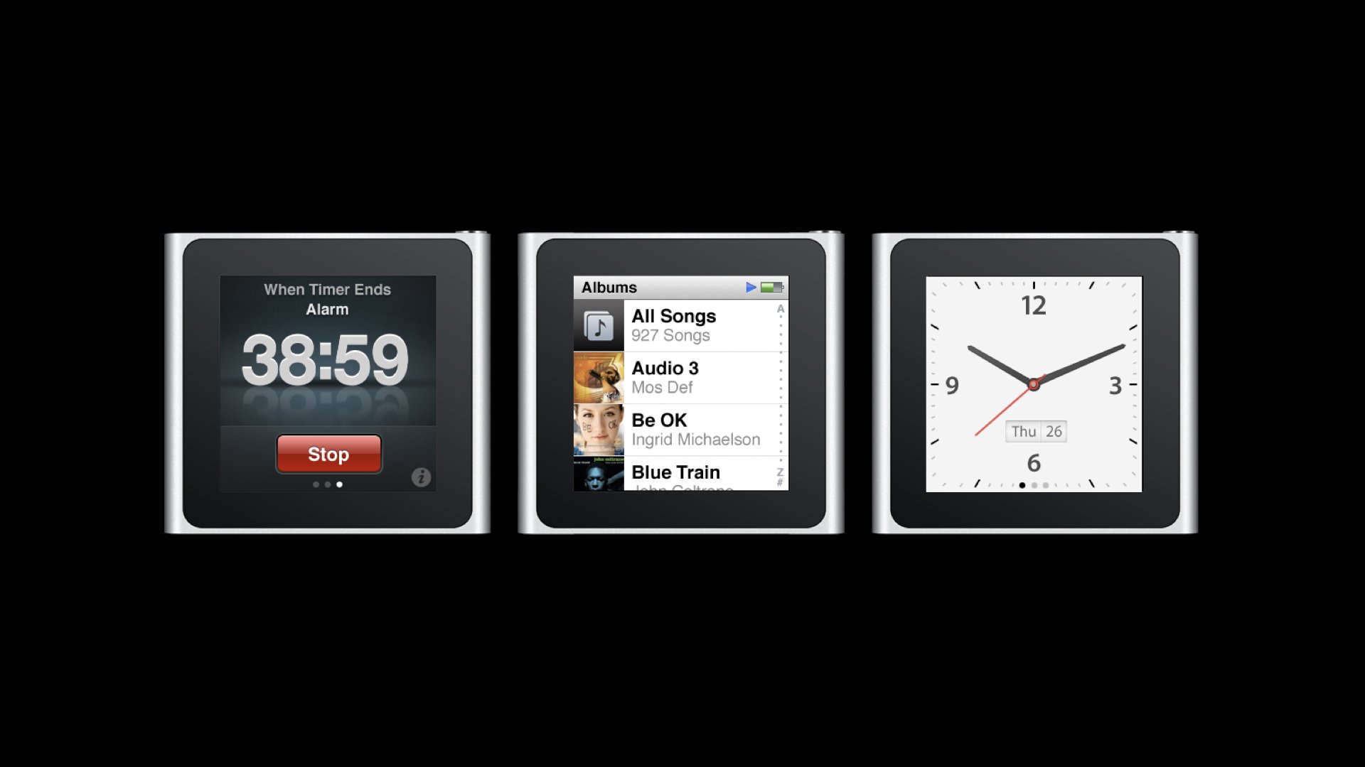
In 2010, iPod’s popularity was still at an all-time high, but that never meant we would rest on our laurels. The miniaturization of tech was constantly providing us new opportunities to reshape our product form factors. Learning from what iPhone had taught us in touch screen technology, we sought to challenge the status quo in what was expected of MP3 players’ portability and ease-of-use, and apply those insights to the next generation iPod. iPod nano ushered in the advent of Apple’s smallest and most personal touch screen device, setting the groundwork to later become the Apple Watch. Before getting there, we had to solve some tough user interface problems. Most notably, the smaller the screen, the less space is allocated to view your content. And because our music libraries are basically glorified lists, it meant that only a few items would be visible at any given moment. Meaning, lots of scrolling.
iPod nano ushered in the advent of Apple’s smallest and most personal touch screen device, setting the groundwork to later become the Apple Watch.

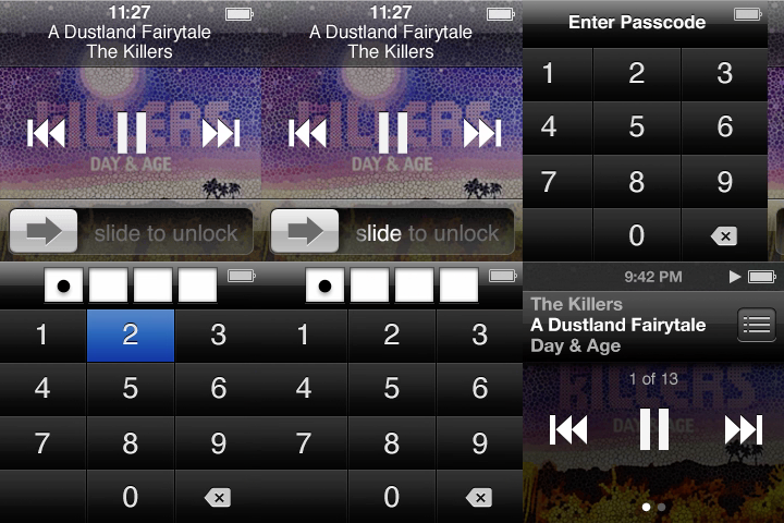
iPod nano’s small screen required a simple and small interface, and while we explored many possibilities, it felt right for it remain recognizable. The iPhone interface was the choice due to its success as a touch-screen interface, but there were a few things that proved to be problematic about this: 1. human fingers easily obstruct the view, and 2. the status & navigation bar occupied almost 25% of the vertical screen real estate and 3. there would be no physical Home button.

We settled on a controversial decision: remove the navigation bar (which includes the Back button), and teach users that swiping from the left edge of the screen would be the gesture to use for going back the previous screen, and press and hold anywhere would bring you home. It was risky, but it worked. And that Back, gesture eventually made its way to the iPhone.


A small experiment that turned into something big.
The clock app had been a part of the iPod OS for years, driving the calendar and alarm functionality. The square form factor we were working with was begging for a non-digital clock interface. It inspired the decision to use traditional watch faces for the design of the clock app. A prototype was built and this increasingly became one of the favorite features, with various team members wearing iPod as a wrist watch. We showed it to Steve Jobs and he liked the idea.

When it came time to decide what the final watch face should look like, we printed out various options for Steve to review on many sheets of glossy paper where he marked his preferred and least favorite. The circled one in the middle is the one that shipped.

After shipping, a few manufacturers created custom wrist bands specifically designed for the iPod to be worn as a wrist watch, signaling the beginning of the eventual Apple Watch.

All Case Studies


