Nex Playground
Building a New Companion for Play
Playground started as a simple idea
Nex had already developed active entertainment experiences (apps) on mobile devices designed to help people reconnect with the joy of movement. But we observed that these experiences introduced a fair amount of friction just to keep people retained. Most of that friction was due to setting up the phone or tablet to properly track the body each and every time the user wanted to give our activities a try. So the idea of a hardware product designed to lower that friction and breathe new life into the living room became a real project.
Once we all aligned on this investigation, we started developing the business case for the product. An important piece of kicking off this project was to acquire the proper insights to help the team make informed decisions, particularly because the company was new to hardware. I started by gathering research of user behaviors and buying patterns from adjacent industries to help the team develop a strategy for pricing and market appetite. I worked with cross-functional partners to establish the business case for the product, from COGS through to geo-expansion strategies. Once we gained enough confidence to move forward and bring this idea to life, I hired industry veterans to develop a uniquely opinionated industrial design to begin the company’s gradual transition from software-only to software+hardware.
I established the design goals for the hardware early on to assist the industrial design team and internal stakeholders alike. We used this as a framework for decision-making and evaluation.
Additionally, I wanted us to keep some of our brand and user interface goals in mind, so I made sure the team was also mindful of aligning the software and hardware together more closely.
Boldness
It shouldn’t shy away from garnering attention, or being loud. It should be colorful.
Uniqueness
It meant that it needed to feel and look different from other similar game or app launchers, and uniquely Nex.
Memorable
It should feel special, lighthearted, and creative. It should remind users that the quirkiness of being human is something worth celebrating. In other words, it should be a Pixar animated film turned into a user interface.
Behind the Design
Our Starting Point
Design Explorations
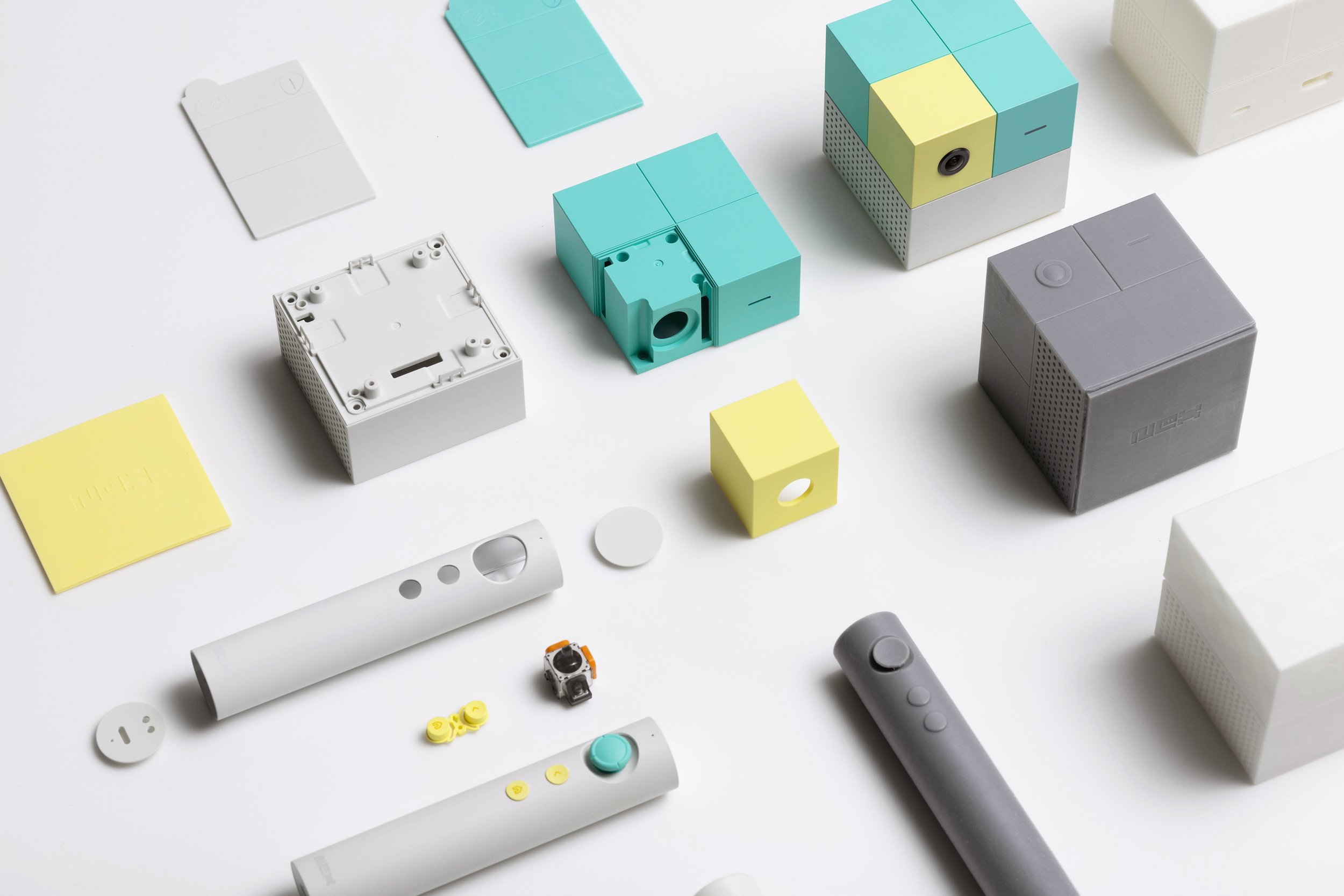
We enlisted the help of level, a design studio based in San Francisco (co-founded by two moms), to take my design brief into the next phase of execution. We faced many challenges of course, and even some fairly significant design pivots along the way.

Form Factor
Initially, we believed the device needed to allow users to perch it on top of the TV, similar to many webcams. We later became more comfortable eliminating this as a constraint.
Visibility
We conducted a comprehensive camera sensor investigation that started because we didn’t want our customers burdened by an additional setup instruction. This meant Playground could be placed anywhere from any possible height from the ground, without requiring the user to tilt Playground to better see them for gameplay.
Usability
We struggled to conclude on the most effective (and simplest) form of remote control for our users. A primary concern of ours was whether it was simple to comprehend at first glance, whether it was clear how many functions it allowed, but most importantly, was that we didn’t want it to be perceived as a traditional video game remote. We believed the tactility could be beneficial when playing sports games with racquets or bats, or swords, or wands, but we wanted the gameplay to be driven by your body movement—not the controller
We heavily debated on various directional inputs and eventually landed on the joystick.


Privacy Control
We considered an automated privacy shutter that would open automatically when the camera is in use, but deemed that it was still not under the customer’s full control—nothing more trustworthy than a non-digital solution.
We focused on the smallest of details, like the strength required to pull the magnetic camera cover off Playground. We like to call this camera cover the “monocle.”
Tilt Stand
Even with our ultra-wide camera, we wanted to ensure we covered as many scenarios as possible. Even though it might only affect an estimated 5-10% of users, we decided to include a tilt stand for everyone, just to be certain no one would run into scenarios where Playground was unplayable.
Colors
We wanted to make a statement with the color choice. We were concerned about Playground fitting into people’s homes, and were sensitive about it being too provocative for the living room. In the end, the boldness was something we decided to embrace, concluding that the joy it would bring into people’s lives will be synonymous with the visual attention it demands.
90 days
to sell out of the first batch
1.5 yrs
from kick-off to launch
40%
week 4 retention*
4.9
Amazon.com Customer Rating
62
NPS*
0.5%
Return rate*
*As of February 2024


