A passion-play
Giving entertainment a fresh new interface
Honoring the Art
Music has long been a passion for Apple. The iTunes Music Store had become the go-to destination for music, and Apple was quickly establishing itself as a media powerhouse. As a casual musician, I thought it appropriate for Apple to honor the art and the artists that we all enjoy listening to every day.
One way I thought to do this was to find a new way to represent the genres and sub-genres that defined the global music landscape. Music can speak to us at a deeply emotional level, and I believed that another form of art could pair well with it. Using photography to capture the meaning and driving force behind music genres felt like an appropriate way to honor it, and to also help those browsing for new music to get a gist of the feel of the genre.
Folk
Metal
Blues
Hip-Hop
On iPod, the presentation of the album art for the currently playing song was designed to maximize the amount of screen it occupied. This is often the right choice to make, but can also limit the layout’s balance of image and typography. The ‘Now Playing’ screen was traditionally designed as a standard user interface (left). I saw an opportunity for us to break the tradition and bring in some graphic design sensibilities to this “hero” screen (right).
The media platform born out of the iPod gets a facelift on iOS
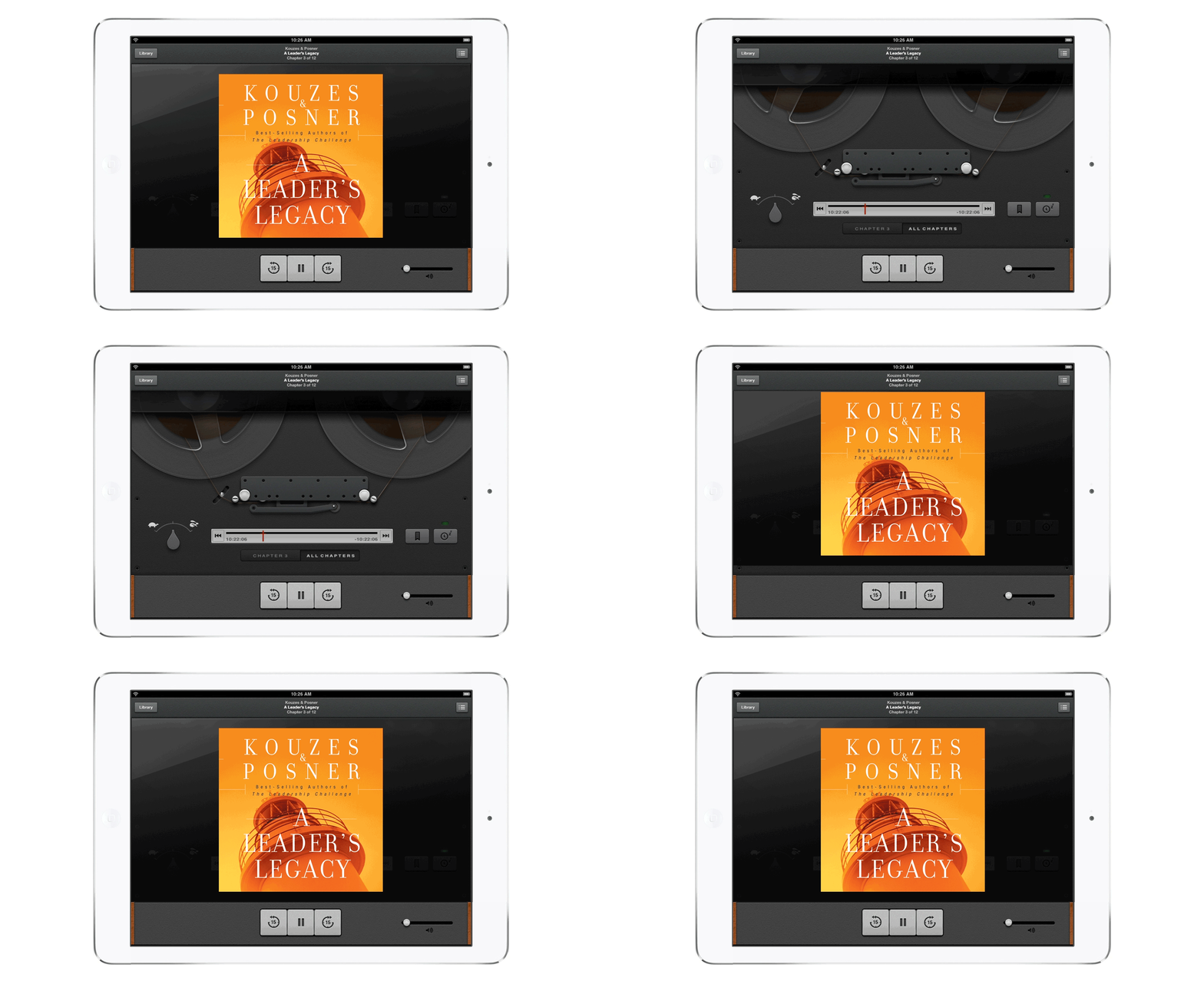
Steve Jobs had long been leading the charge of skeuomorphism inside the walls of Infinite Loop, and the new standalone Podcasts app became the chance to experiment in ways that the iTunes Music app wouldn’t do.
Inspired by vintage audio equipment, the interface hid an animated reel-to-reel visual graphic behind the podcast cover art along with audio playback controls. The iPhone version of the app presented the interface in a manner that matched the original vision—as an Easter egg, of sorts. The iPad version saw the reels occupying more screen real estate. Before launching it to the public, it was reviewed and well-received at Apple’s Top 100 meeting that year.
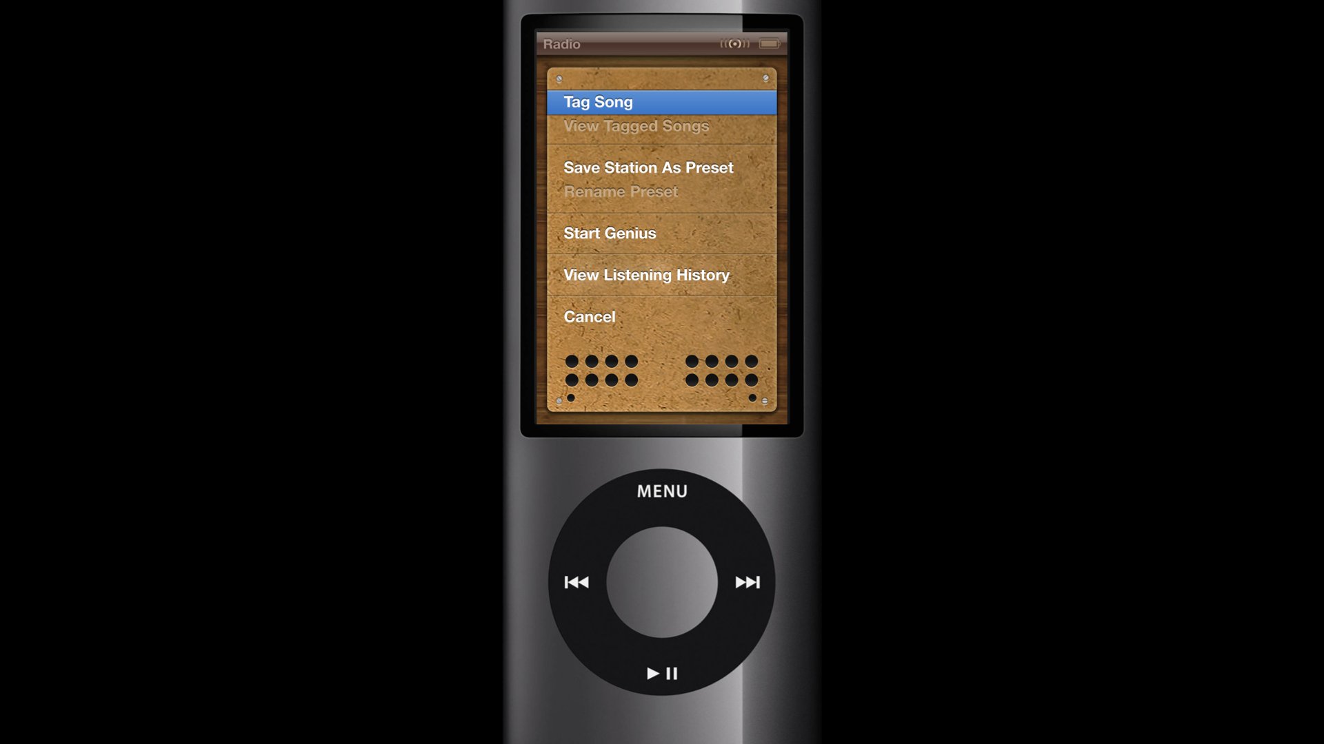
The iOS ecosystem was quickly becoming a playground for visual interface exploration. And some of the output was visually rich and inventive. I thought the iPod was lacking some of this attention and explorative spirit. I explored a variety of ways to bring this spirit to the platform.
Giving iPod the same visual attention that iOS apps were getting
The album booklet redefined for the perfect consumption device
The experience of listening to music was typically a passive one, but we were always intrigued by the nostalgia of holding album covers in our hands while listening to a new album. And I was fascinated at the idea of what the digital version of that could look like. I leveraged iPad’s Now Playing screen to bring a magazine-like visual format to the Music app. It leveraged live online content including tweets, photo uploads, and concert details.


